I took a trip to the Design House this week to photograph some new items for the Lucketts online store, Shop Lucketts. The products Suzanne & Amy ordered from the January design shows arrived {finally!}, it was a little overcast {not a huge deal}, and I had a limited amount of time to stage and photograph a bunch of new products {uh-oh}.
Here's what happened when I got home and looked through everything and why I created a photo fails folder on my laptop...
Staging isn't my favorite thing, but I thought I had this cloche lookin' pretty good. Then I got home & noticed the un-hung beaded chandelier in the shot....ugh.
Solution: some creative cropping and no one has to know there was a chandelier less than a foot away on the table.
I call this the Henry photo bomb. All he wanted to know was if I liked where he hung the gold port hole mirrored cabinet....and then he just stood there....and kept talking....never realizing he was smack in the middle of the mirror I was trying to photograph.

Solution: Open the cabinet and make Henry go away {temporarily}...{just kidding Henry, you know we love you}
The earthquake shot. Angles are fun, but these new vases and moss balls look like they're ready to slide right off the mantle.
Solution: change the angle of the photo for a more straight-on photo.
The extra reflections on this clock face made it a little too unreadable.
Solution:
close the curtains reflected in the clock face. Sometimes you can
angle your camera or slightly reposition where you're standing and
eliminate the glare on clocks and artwork. If you're showing up in a head on shot, sometimes
you can slightly reposition your body or hold your arms up {or use a
tripod} and take the photo. I'm actually hiding behind the urn in this photo and you can see the edges of my jacket, but I thought that was better than the glare.
Here are a few other oops moments and things to watch out for...
This one isn't too bad, but the angle of the mirror in the background is creating some odd reflections that are distracting.

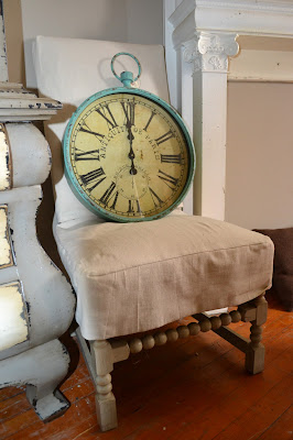
Oops, the flash was on by mistake. Using the flash when there is good natural light creates weird shadows. {I'm also not really sure what this photo is supposed to show. I think I was going for scale of the clock, but a clock on a chair by a faux fireplace is a little strange.}
When you're not sure how to stage the
new pad of cheese paper and you don't have cheese, just throw it in the
middle of the table and hope for the best!
A photo of part of a tray.....on the floor.....lying next to a dresser. Trying to be artsy? Hmmmm.
Take a pic of the Torani syrup, two glasses and a cheese board lazy Susan....
...if it's not working, switch it up and move the syrup ON to the lazy Susan to fix everything.....ummmm, nope.

All of these items are part of our new spring collection online. We are adding new items every few days this month, as they come in so be sure to check out our online store, Shop Lucketts.
Okay, so those are my silly product photos for this week. What's the weirdest or funniest interior photo you've taken, that you thought looked good at the time?


Thank you for the great tips! (and a few laughs...)
ReplyDeleteEmily